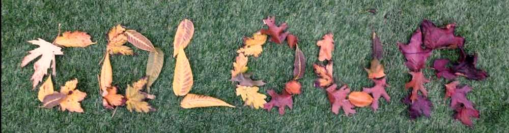
Just back from a bracing ramble among the autumn trees and the leaves are really turning. I can never resist gathering up a few so that I can enjoy their fleetingly vibrant colours at home. I thought it would be a good introduction to the design process and in particular one way to plan and select colours for woven textiles. So I am going to start by looking at how we can draw inspiration from the natural world around us.
Of course you can just as easily draw inspiration from architecture, art, or cracks in the pavement. And you could use the same source to develop ides’s about texture. but this post is about creating your colour palette.
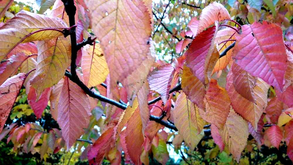
And where better to draw inspiration than nature. Colour in nature is hugely significant. Nature not only has a way of creating the most beautiful colour palettes but these colour palettes are also hugely emotionally significant to human beings. Whether it is evolutionary in origin or leans more toward our poetic souls, we have been drawn meaning and significance from the natural landscape for thousands of years.
For Europeans, the turning of the leaves as autumn arrives is the first warning that the cold, lean and hungry times are on the way. We all of us, animals and people, are finely attuned to notice and read these cues and to set about gathering and storing the things we will need to survive the winter as fast as we can. Our body begins to desire sleep, warmth, comfort, and wholesome calorie laden food. And we gather – or at least we did and some of us still do – fuel for the fire and fruits, nuts and berries to store. We dig out of storage all the warmth and comfort providing materials we cast aside in the summer, to protect us from the cold, wet or frosty long and dark nights. We block up any drafts in our homes and hunker down for the winter.
The colours in the photograph above, trigger all those emotions in me. There is the last fading green of summer in the ribs of the leaves, the saturated red of ripe berries, the yellow gold of ripe and mellow apples, and the hint of the dry and bare brown of winter to come. But back to practical stuff…
Working with colour
How does one translate all this into a textile. There are probably lots of ways but I am going to share with you the method I was taught was.
So STEP ONE: go out and find your inspirational source and take lots of photos so that you can come back to it once you are at home. If you can sketch – I can’t – go out with crayons and sketch book and capture these impressions that way. Perhaps bring back something, provided you have permission to gather the material.
STEP TWO: Look closely at your source material, your photograph, or your sketch. Really study it to see the full range of colours and then go to your yarn stash and select as many of the colours you possess which closely match those in your photograph or sketch.
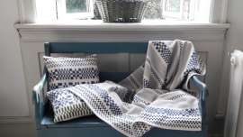
STEP THREE: Cut a piece of card about 5cm by 12cm and wind your yarns around it to make a colour wrap. Use sticky tape, bluetack or a spray adhesive to keep the loose ends in at the back. Like this… (except I used my wooden ruler as I was out of card).
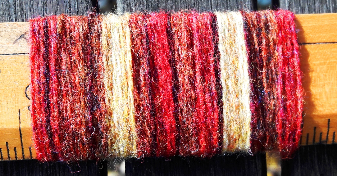
.
STEP FOUR: Note on the card the names (or code numbers) of the colours you have used and any other information you want to store, like the source of the yarn, fibre type, yarn count, etc. If you are printing out your photograph then you can keep both of these in a plastic sleeve and put it in a design project folder.
Having decided which of your yarn wraps you prefer you can n ow start on your textile design. I’m not going into that here but will visit it in another post so we will move swiftly on…
Keeping good records
STEP FIVE: If you design in weaving software you can print out your design and keep that with your colour wrap and photograph.
STEP SIX: And when you come to work out your warping instructions, etc. you can store that too.
STEP SEVEN: And when you get onto sampling you can put your samples in too. Then you will have a complete record of your project for future reference.
STEP EIGHT: Lastly, if you intend to sell your work you will need to do some calculations to work out what you need to charge for your work. Again, this is another topic for another post so I ma not going into it now.
You now have a complete project record. It will be a working record in that you can come back to it at any time and make the time again, or perhaps look again at how you might refresh it. Don’t think you can skip any of these steps. My experience is that you simply cannot. It is easy to think we will remember what we did but we just don’t. And it is really important to keep all the workings, your calculations, samples, weave instructions together, not in separate places. If you are at alike me, really keen to get started but a bit dyslexical and not too keen on record keeping then you are likely to have your records scattered about the place. Before the month is out you won’t know where they are, or won’t be able to follow them. So take the time to do it methodically, as you go along, no matter how desperate you are to get started on the actual weaving.

So here is another example.
There’s always more than one way to get to the right place
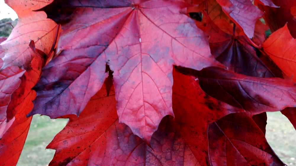
But what do you do if you don’t have a large stash of yarn and need to go out and purchase the colours you need. Well, there are lots of free colour palette tools online that allow you to upload an image and extract the colours in it. They can also be a good tool to check up on how many colours you are actually seeing. So, I took the photograph above and put it into palettegenerator.com and got the following palette. Now I could print this out and head off to my favourite store – The Handweavers Studio and keep the headache out of picking my colours.

The results you get from colour palette generators can be quite an eye-opener. How much had you registered the soft green and beige in the background of this photograph of maple leaves? Would having an accent in these colours give a better colour palette to create your design in? Maybe?
So, in finishing let’s just summarise the process again.
Designing with colour – step by step
- Get out and find your inspirational source material. If you can bring some material home, e.g. a few choice leaves, so much the better.
- Take photographs or make sketches.
- Look closely to really see all the colours.
- Select the yarns that match the colours you have identified.
- Make a colour wrap. Try another, experiment with the proportions of colour.
- Think about accents – maybe you would like t introduce an accent colour, or a different texture or fibre.
- Note on the card the colours used, the yarn type, source of yarn, fibre, yarn count.
- Put it in a plastic sleeve and into a folder, along with a copy of the photograph, or write the file reference number if this is stored electronically.
Project records
You will want to add to this initial record as you develop your project. Things you will want to include are:
- Initial photographic or sketch record of source material
- Colour wraps and notes
- Textile design – weaving draft or sketch
- Warp and weft calculations
- Sampling records
- If you want to sell your work you will also want to do some calculations to establish what the price should be.
I will be developing the Design Process thread as a resource for weavers so as this builds you will be able to find out how to make the calculations you need for warping, how to keep sample records and how to calculate you prices.

Leave a Reply